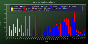
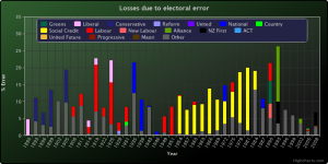
With the referendum on voting methods in New Zealand coming up in December, I thought it might be interesting to draw up some graphs to compare the results we’re getting under MMP to the results we got under First Past the Post, the system we used to use.
I’ve plotted two sets of graphs: a pair of time series showing error over New Zealand’s electoral history since 1890, broken out to show which parties benefited and lost from error (shown below – click on the graphs to expand them), followed by a complete set of graphs of NZ’s electoral results since 1890 (on a separate page).
The time series are the most interesting: they show that electoral error has dropped significantly from the 1996 election onwards, when MMP was adopted, from an average of 12.4% error to an average of 5.5%. It’s important to note that the variance dropped significantly, too – from a standard deviation of 6.3% to 2.1%. For those not versed in statistics, this implies that the error under FPP is less clustered around the average – despite an average of 12.5%, much higher levels of error were possible under FPP. Looking at the data, we can see that six out of New Zealand’s 34 elections under FPP had error of 20% or greater – that’s an election in which 1 in 5 New Zealanders effectively had their votes handed to another party. That’s not democracy.
Looking at the details of who gained and lost, you can see that pretty much universally, gains went to one of the larger parties; the Liberal and Reform parties in the early years, followed by National and Labour since the 1930s, with National gaining about two thirds of the error votes since 1949 (in those elections, an average of about 9.4% of New Zealanders had their votes transferred to National, compared with 4.4% for Labour).
The losers, then, were predominantly small parties, though Labour, now a large party, took a hammering in the 1910s and 1920s during their formative years. More recently, the Social Credit party had virtually no seats in Parliament between 1954 and 1981, despite winning more than 6% of the vote in each of those elections, and sometimes up to 20%. Again, that’s not democracy – if they’d won that many votes under MMP, they’d have 16 or 17 MPs, compared with the maximum of 2 they had in 1981 and 1984.
My goal in doing these graphs was to make the numbers a little more accessible for people considering their options in the coming referendum. While MMP has its flaws, it’s important to remember that a vote against it should be tempered with a vote for a better system:
- First Past the Post is very definitely not that system. If, after looking at my graphs, you think that FPP is a better system than MMP, you’re either having trouble reading them or you’re in favour of an oligarchy, presumably including yourself. Let’s just be clear on that – if representing all New Zealanders is the goal of our elections, FPP is an appalling system.
- Supplementary Member is effectively FPP-lite in that it includes proportional voting to some extent but, depending on the size of the proportional component, it seems able to lead to results that are even worse than FPP. Since votes under supplementary member are collected in a similar manner to MMP, I can model the last 5 elections under different versions of it for comparison. Hopefully, I”ll have time to do this in a future post.
- Single Transferable Vote and Preferential Voting have their pros and cons; theoretically, Condorcet voting, a form of preferential voting, performs optimally for the selection of an individual candidate in a single electorate, but since Parliament is a series of electorates, it remains vulnerable to the same problem that FPP is – that is, one party can win many electorate seats with this method, leaving a large number of voters whose opinions are not included. If I have time, I may do some work with the results from elections in places that use these systems.
Under our current system of MMP, error still exists. There are three primary reasons for this:
- Firstly, there will always be a rounding error as we turn divide votes in the thousands into a small number of seats; this will always create a small error – perhaps 1%, depending on the allocation scheme.
- Secondly, there will always be small parties who don’t meet the threshold for even one seat; votes cast for them round to zero, and are error. If history is anything to go by, these account for another 1 or 2 %.
- Finally, our current system requires that parties either win an electorate seat or meet a threshold of 5%. This accounts for the bulk of error under MMP; in 1996, 6% of the 7.6% error was caused by the failure of the Christan Coalition and the Legalize Cannabis Party to reach 5%; had that rule not been in place, they would have won 5 and 2 seats, respectively. Similarly, in 1999, the Future NZ, Legalize Cannabis, and Christian Heritage parties accounted for 4.6% of the vote, which became error.
My current opinion is that the 5% threshold rule causes too much electoral error to be warranted for any reason. I’ve heard the argument that helps prevent small parties from holding the balance of power, but it seems to me that deal-making and compromise are what politics is all about. I’m keen to other arguments if they’re out there – I’ve not looked very deeply into the reasons for this, so my opinion is really just gut reaction. In the end, I have to weigh all arguments for the threshold against the fact that with it, between 2 and 6% of New Zealanders will have their consent given to another party, which is, as I keep saying, not democratic. To put that in perspective, that’s between 50,000 and 150,000 people disenfranchised.
A couple of details, then:
- I’m defining electoral error as the difference between the votes received by each party and the number of seats awarded, divided by two so I’m not double counting gains and losses. Error is shown as a percentage, being the percentage of the electorate whose votes were effectively ignored in the allocation of seats.
- The other category in the graphs is created from parties that have never won a seat in Parliament. Some of these gained significant numbers of votes at various times, but I’ve had to exclude them to keep things manageable.
- All of my data comes from Elections NZ, by way of http://www.electionresults.govt.nz/. If you want to look at the processed data I used to draw my graphs, you can do that here. If you find any errors, please let me know.
Since I can see others wanting to use these graphs, here’s a license for doing so:

This work is licensed under a Creative Commons Attribution-NonCommercial-ShareAlike 3.0 Unported License. Note that copyright applies for the raw data from Elections NZ and HighCharts, the Javascript graphing library I’ve used for the interactive graphs).
![[ meme – hazard ]](http://www.meme-hazard.org/blog/wp-content/uploads/2016/11/mh_banner.png)

